April 2nd Update

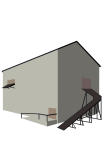
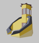
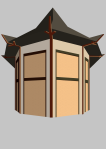
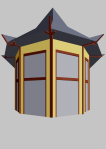
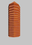
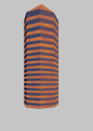
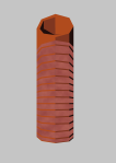
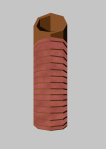
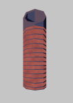
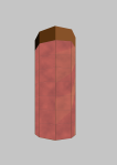
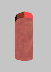
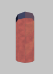
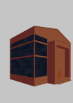
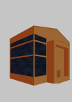
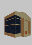
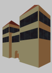
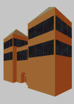
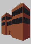
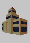
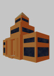
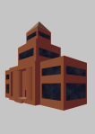
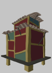
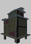
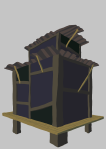
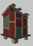
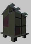
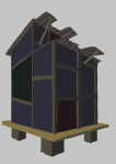
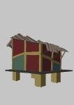
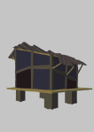
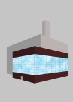
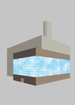
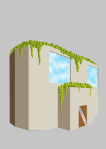
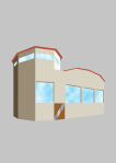
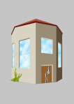
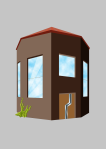
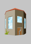
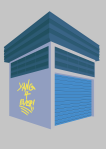
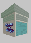
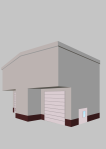
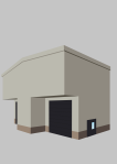
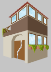
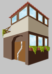
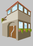
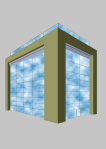
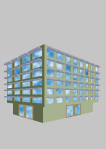
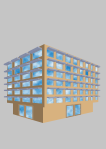
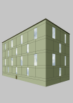
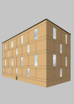
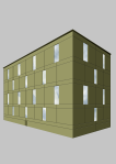
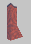
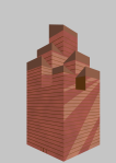
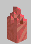
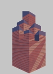
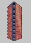
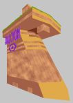
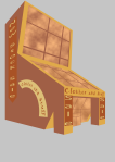
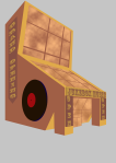
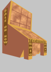
The third Landmark, this is a pretty important one, Its the Team’s main base, Hojo:

HojoBase

I’ve had a really clear idea of this one for a while now, Its human made, but I wanted to make it look like there was an attempt to incorporate the rounder architecture of Altherkin buildings to make a combination of the two cultures. I still want to mess around with the scale of the building in sections, but that rough shape is what I’ll be sticking with.

Secondly I wanted it to match the military district, so I took some of my earlier colour schemes and used them for different elements and I’m very happy with the result.

Anyway that’s it for this week, the progress list is as follows:

  • Character Concepts
    • Background extras:42/42
    • Main Characters: 13/13
    • Main character re-designs: 5/5
    • Secondary Character: 14/14
    • Secondary Character re-designs: 5/5
  • Weapon Concepts
    • Main Characters: 12/12
    • Secondary Characters: 7/7
    • Weapon Redesigns: 4/4
  • Scene Concepts
    • Interiors: 0/24
    • Landmarks:3/15
    • Exteriors:39/39

Season 1 Background Buildings

My second biggest milestone after the background characters

I feel this puts me overall past the half way point with the concept art. These milestones are really important to keeping motivation throughout the boring parts.

Anyway until Next time,

Marc Out ~~

October 29th Update

Second Set of government buildings this week:

This slideshow requires JavaScript.

After sleep on the last week’s designs a while I’ve actually changed my mind about about them, once again I don’t want to distract too much from the main set pieces, and giving them a more foreboding look isn’t really a factor until later seasons, so I’m getting a bit ahead of myself.

One other thing that ties into this topic, which I forgot to talk about, was actually the colours I chose for these particular concepts, which is heavily based off of Russian buildings built during the soviet era:

xkremlin-pagespeed-ic-_jcvbwxgjw

I muted down some of the colours to prevent them from grabbing too much attention, and with the right lighting could be seen as both hopeful and oppressive based on the mood I’m trying to create.

Anyway, here is this week’s list:

  • Character Concepts
    • Background extras:42/42
    • Main Characters: 13/13
    • Main character re-designs: 5/5
    • Secondary Character: 14/14
    • Secondary Character re-designs: 5/5
  • Weapon Concepts
    • Main Characters: 12/12
    • Secondary Characters: 7/7
    • Weapon Redesigns: 4/4
  • Scene Concepts
    • Interiors: 0/24
    • Landmarks:0/15
    • Exteriors:26/39

That’s all for this week,
Until next time

Marc Out~~

June 25th Update

Last of the military Sector Buildings this week:

This slideshow requires JavaScript.

This was another building I took inspiration from my trip around Dublin, which I based on this building:

20180609_172851

Following the same logic as last week’s concept in making the building defend-able so I added the shutters at the top of the windows, I wasn’t able to convey it with the angle I took, but I picture the glass at the top lowering into the main structure, which I think will be easier to show when I model it in 3D.
I decided to keep this design simpler that last week, mainly because I’ve been quiet busy with non-Fade related things, but hopefully I’ll be free to get more done in the next few weeks.

Anyway that’s it for this week,  the progress list is as follows:

  • Character Concepts
    • Background extras:42/42
    • Main Characters: 13/13
    • Main character re-designs: 5/5
    • Secondary Character: 14/14
    • Secondary Character re-designs: 5/5
  • Weapon Concepts
    • Main Characters: 12/12
    • Secondary Characters: 7/7
    • Weapon Redesigns: 4/4
  • Scene Concepts
    • Interiors: 0/24
    • Landmarks:0/15
    • Exteriors: 9/39

That’s all for this week,
Until next time

Marc Out~~

June 19th Update

Apologies for the day late update! This particular concept took a while to complete, but I think it turned out well:

This slideshow requires JavaScript.

The city in Fade is built from the concept that war is a regular occurrence until recently, so many of the building will have some sort of defences, I haven’t shown this previously due to the Human business sector paying extra to hide the defences and The commercial sector being a newer area to be built up, however I may go back and change it later. The military sector however needs to have this feature of the culture be very clear, so the previous design had the Arrow slit Windows and this one has blast covers that lower onto the windows, which is an idea I got from this building in Dublin:
20180609_175737

That being said the blast covers were extremely tedious to draw and while I don’t think its noticeable a lot of the perspective is off on a few, I don’t think I’ll be drawing a building this complicated for a while.

Anyway that’s it for this week,  the progress list is as follows:

  • Character Concepts
    • Background extras:42/42
    • Main Characters: 13/13
    • Main character re-designs: 5/5
    • Secondary Character: 14/14
    • Secondary Character re-designs: 5/5
  • Weapon Concepts
    • Main Characters: 12/12
    • Secondary Characters: 7/7
    • Weapon Redesigns: 4/4
  • Scene Concepts
    • Interiors: 0/24
    • Landmarks:0/15
    • Exteriors: 8/39

That’s all for this week,
Until next time

Marc Out~~

June 11th Update

This week we start on a new set of buildings, the military Sector:

This slideshow requires JavaScript.

This is a more functional building that the previous ones, I went out and looked for some real life references to get ideas from, so I took a trip into Dublin city and stumbled across one of the entrances to Trinity College which really stood out to me

20180609_172335

The thin windows reminded me of the Arrowslits in Castles, so I decided to implement the same thing into the building design, although I probably made them a little too wide, but I’ll have to see how they look when 3D modelled to be sure.

Anyway that’s it for this week,  the progress list is as follows:

  • Character Concepts
    • Background extras:42/42
    • Main Characters: 13/13
    • Main character re-designs: 5/5
    • Secondary Character: 14/14
    • Secondary Character re-designs: 5/5
  • Weapon Concepts
    • Main Characters: 12/12
    • Secondary Characters: 7/7
    • Weapon Redesigns: 4/4
  • Scene Concepts
    • Interiors: 0/24
    • Landmarks:0/15
    • Exteriors: 7/39

That’s all for this week,
Until next time

Marc Out~~

December 4th Update

The start of the holiday season and I have another weapon concept, this time Damson’s:
FireStarters

The Idea I wanted to get across in the two lower reference images is that a ice blade can be formed to turn the guns into a melee weapon, and this concept formed the basis for how I wanted to design the guns, I wanted to have a duelling pistol grip that would look well in either gun or sword form:

18duel-2swords-cane-sword-w-old-fashioned-pistol-grip-cs-009

So what I did was look for a few more futuristic looking guns and mix and matched the parts:

Overall I’m pretty happy with how they turned out, I’m leaning toward the lower design, which I feel looks a lot sleeker.

I would have liked to get another weapon concept done this week, but with college I just ran out of time, perhaps next week.

Anyway, here is this week’s progress:

  • Character Concepts
    • Background extras:42/42
    • Main Characters: 13/13
    • Main character re-designs: 5/5
    • Secondary Character: 14/14
    • Secondary Character re-designs: 5/5
  • Weapon Concepts
    • Main Characters: 3/12
    • Secondary Characters: 0/7
  • Scene Concepts
    • Interiors: 0/24
    • Exteriors: 0/20

That’s all for this week,
Until next time

Marc Out~~

November 13th Update

Second last redesign, this week its Kusanagi Tsurugi: 

Kusanagi2

Once again there wasn’t a lot I wanted to change with this design, but I wasn’t happy with the lizard like look of the old face and the reverse wings I was experimenting with:
kusanagi
I also wanted to make him look more intimidating, and I noticed I forgot to draw a finger on his right hand, which gave me the idea to give him some scars, which will make a lot of sense since he is essentially a veteran from a losing army.

With that I only have one more redesign to do, which will leave the character design milestone done! Now this doesn’t mean I won’t be completely done with making character, there will be some scene specific characters and background extras I’ll need to do, but I wouldn’t consider them as high a priority as the building and weapon concepts that will need to be done.

Now, onto this week’s status on concepts:

  • Background extras:42/42
  • Main Characters: 13/13
  • Main character re-designs: 5/5
  • Secondary Character: 14/14
  • Secondary Character re-designs: 4/5

That’s all for this week,
Until next time

Marc Out~~

November 5th Update

This week’s redesign is Sho:
Sho2

This was a tough one to design, because it required removing a lot of details from a design I loved, but that didn’t match the human military style I was going for:

Sho

Like the others I based the new design off of the uniforms of the other human Military:

But to keep him unique I decided to veer away from the usual cream colour, however I didn’t want to use the old colour scheme of Sho’s earlier design, since it makes him look a lot like a villain which wasn’t the intention of the character, hes a supporter rather than an antagonist, so I used the blue Human military background character as a start and then took the darker aspects of his old design as highlights rather than the main focus colour.

Now, onto this week’s status on concepts:

  • Background extras:42/42
  • Main Characters: 13/13
  • Main character re-designs: 5/5
  • Secondary Character: 14/14
  • Secondary Character re-designs: 3/5

That’s all for this week,
Until next time

Marc Out~~

October 30th Update

Last Update of October, and this week its a redesign of Haru:
Haru2

I was a little strapped for time this week, so rather than fumble around with the face, I found a reference image that matched the angle and traced it, the final result went a little too realistic for my liking, but it gets the idea of the character across.
The design itself I’m really happy with, I simplified the design down a lot while keeping her looking offical:

Haru

A lot of this was done by matching her uniform to the other Human Military designs I’ve made:

This lets her look like she fits with the more Western feel of the Human Military, and by keeping the red from her old design it helps her stand out and retain her individuality.

Now, onto this week’s status on concepts:

  • Background extras:42/42
  • Main Characters: 13/13
  • Main character re-designs: 5/5
  • Secondary Character: 14/14
  • Secondary Character re-designs: 2/5

That’s all for this week,
Until next time

Marc Out~~