June 18th Update

Only a handful of landmarks left now, this week is the Villain’s base:
BlindfoldCodeWarehouse.png

The Group hides out in the warehouse district, so I used the colours from those concepts, but then used some of the logos on the blindfold code followers as graffiti to make it stand out a bit more, while still keeping it discrete enough to be a useful hideout. I plan on adding more detail to little things like the boards covering the windows when I’m making the 3d models, but overall I’m happy with it.

Anyway that’s it for this week, the progress list is as follows:

  • Character Concepts
    • Background extras:42/42
    • Main Characters: 13/13
    • Main character re-designs: 5/5
    • Secondary Character: 14/14
    • Secondary Character re-designs: 5/5
  • Weapon Concepts
    • Main Characters: 12/12
    • Secondary Characters: 7/7
    • Weapon Redesigns: 4/4
  • Scene Concepts
    • Interiors: 0/24
    • Landmarks:9/15
    • Exteriors:39/39

Until Next time,

Marc Out ~~

August 6th Update

Last of the warehouses today, honestly I’m pretty happy with these ones:

This slideshow requires JavaScript.

This was the kind of warehouse that’s going to be populating a large portion of the warehouse district, I’ve always loved the look of run down buildings like this one, which quite a few good references exist for:

Also as before I added graffiti, just little in jokes from my college friend:

I really feel like I was starting to enjoy designing these buildings, and I do wish I could make more, but I have to move on

Anyway, here is this week’s list:

  • Character Concepts
    • Background extras:42/42
    • Main Characters: 13/13
    • Main character re-designs: 5/5
    • Secondary Character: 14/14
    • Secondary Character re-designs: 5/5
  • Weapon Concepts
    • Main Characters: 12/12
    • Secondary Characters: 7/7
    • Weapon Redesigns: 4/4
  • Scene Concepts
    • Interiors: 0/24
    • Landmarks:0/15
    • Exteriors:15/39

That’s all for this week,
Until next time

Marc Out~~

July 30th Update

The second warehouse concept this week, and we’re going for a little bit less pristine a building:

This slideshow requires JavaScript.

I just want to point out before going into detail, that the “Death to Rwby” graffiti is just a friendly jab, I genuinely love the show, and all the graffiti is are Easter eggs for it, but in this case there is a lot of people critical of the show, and that’s just a nod to that.

if you want a better look at each one here they are:

The design itself I’m not fully happy with, I wanted the panels on it to look more like armoured plates, since this city is prepared for war at all times, but they came out looking like windows, that being said the buildings themselves aren’t meant to be noticed so I don’t think its a huge issue, I was largely inspired by the design of this Warehouse:

Chapparal Electric

I think the issue comes from the fact I tried to scale down the design for a smaller building, so I had less to work with, which I’m going to take into account for next week’s design.

Anyway, here is this week’s list:

  • Character Concepts
    • Background extras:42/42
    • Main Characters: 13/13
    • Main character re-designs: 5/5
    • Secondary Character: 14/14
    • Secondary Character re-designs: 5/5
  • Weapon Concepts
    • Main Characters: 12/12
    • Secondary Characters: 7/7
    • Weapon Redesigns: 4/4
  • Scene Concepts
    • Interiors: 0/24
    • Landmarks:0/15
    • Exteriors:14/39

That’s all for this week,
Until next time

Marc Out~~

January 15th Update

Another shopkeeper this week, I’m only probably going to do one more of these since there isn’t many shopkeepers in the show as a whole:

This slideshow requires JavaScript.

The Colour schemes are based off of Yoruichi Shihōin and Renji Abarai from bleach and Weiss from Rwby, respectively.
2e7ae2ff28c19b7bebf9211d135dcdaf230px-renjiabaraikuboweissvol4
Although I am worried that the Bleach character’s colours might make them stand out too much, Once I’m done with all the character concepts I’ll do a review of what I feel does and doesn’t work and adjust accordingly, But I suspect all I’ll have to do is just lower the saturation of the more noticeable colours.

I’ve also decided to upload one of my storyboards, I’ll admit that I’ve been reluctant to do this, since I prefer to only show finished work, but that’s against the point of this blog, and so long as I don’t use spoiler heavy shots then it should be alright.
storyboardpreview10

I’m going to try up load one of these every time I have 15 shots drawn up, that way I can pick the least spoilerish of the batch. If you’d like the template that I’m using I got it from an animator called Jazza that posted up his onto Newgrounds Here. I’m not sure how often I’ll be posting storyboards, because they’re still taking a backseat while I decide on the look of the world and its characters, plus I’m still quite slow at gestural drawing, but I want to give myself an incentive to work at them, so hopefully there will be more soon.

Anyway that’s all for this week, Till next week

Marc Out~~

October 23rd Update

Bit of a different update this week, my first batch of extras:

This slideshow requires JavaScript.

I’m pretty happy with how different a simple palette swap make them, The Otherkin in the story are similar to the faunus in Rwby, in that the have at least one animal trait, but unlike Rwby, I’m planning on having the animal trait be varying in how predominant it will be from person to person, these three look pretty human, I’m going to try have the next batch look a little less human. But I’m happy with the speed I got these done, I should be able to mill though these in less time than i thought.

In 3D news, I’ve figured out how to make the graffiti! I won’t bore you with the technical details, but basically the Problem was That I was mixing shaders, rather then the image colours, here’s the finished result:
graffiti2

It doesn’t look like much, but this opens up a world of options for me to help set scenes, Dirt, signs, moss, even blood smears, I don’t have to make custom textures every time I want to have an interesting wall, so I’m pretty pleased with this development.

That’s all for this week, till then.

Marc Out ~~

Naga and 3D updates

Another week another Character concept, this week is Naga:
Naga

Like the other characters I’ve shown he’s based off of a two Mekakucity Actor’s characters, this time its Seto and Shintaro

10274269d1b03d4a3ef801c12bae6c2934b260bc

I disliked Seto over all design but liked the colour scheme, so I worked to stick the colours onto a design that I liked, and I loved the dual coloured jacket that Shintaro has in this picture, which he never wore in the anime, for some strange reason, because I think its the best outfit I’ve seen him in.

In 3D news I’ve been taking a break from my female template to work on two new things: A male template and fixing the transparency problem with my title wall.

I’ll start with the template model, since I’ll get though that quickly. I was attempting to do what I had done with the female model and use a Rwby reference image, and I thought that using mercury would leave little up to imagination but I’ve realised that most of the guys in Rwby have some form of popped collar and waist obscuring drapery, making is difficult to gauge parts of the body, also male eyes are much smaller in Rwby for some reason. Luckily I’ve been able to find a super high res image of Neptune which has been doing the job nicely for now:
MaleTemplate1

The female template I had nearly finished when I started this blog, so I’m looking forward to showing my progress as I go with this one. Also If your curious about the reference image, check it out here:
Neptune-turnaround.png

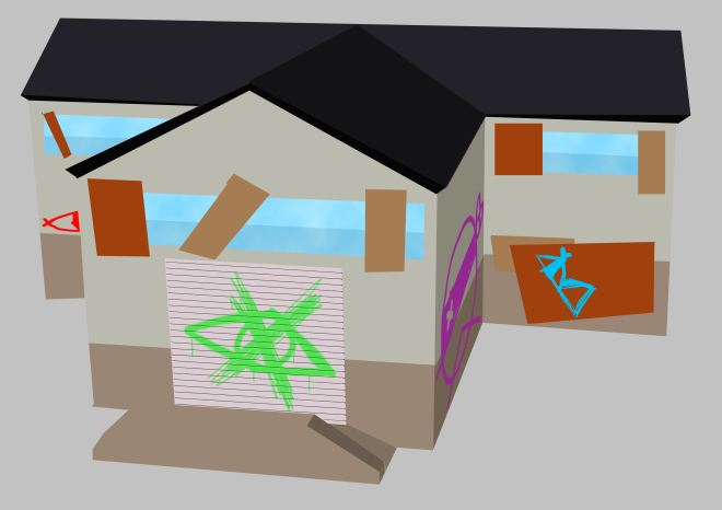
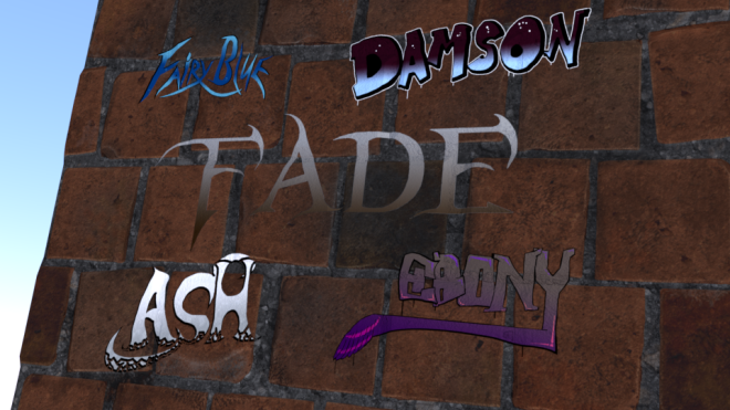
In an earlier blog post Ebony and Material practise I talked about a problem I’ve been dealing with with some of my textures in blender cycles being unnesssarily transparent, I haven’t fully nailed down the problem, but I think it could be in how I’m exporting the images from photoshop, I decided to split my materials apart, making just a graffiti Material:

Graffiti1

And and Wall Material

Wall1

Now it looks to me that the graffiti is still a bit darker than it should be, I went out of my way to make the images bright:

I’m thinking that its possible by making the images .png files its automatically making the image transparent. If there are any experts in blender I’d love to know how you’d handle it in the comments below.

And also in case your wondering, I’ve made this graffiti for the intro of the show, Its going to be very inspired by the Noragmai opening, but more on that closer to when I’m ready to animate it.

Till Next week

Marc Out~~